If you are an indie writer or publisher who wants to make your books more accessible to sight-challenged readers, Vellum for Mac can help you reach that goal. I’ll show you how to create accessible books in Vellum.
Table of Contents
Accessibility in books formatted by Vellum for Mac
Making your finished books accessible may seem like a daunting task. Fortunately, Vellum takes care of most of that work for you, just as it does with standard styles. The accessibility features are included in Vellum, beginning with version 3.1.
The best book format for accessibility is ebooks. When they are read in dedicated eReaders, they have a bit of a head start in that users can usually choose the font and font size that is best for the user’s visual ability.
We’ll look at what you can do to make your ebook even more accessible using Vellum.
We’ll also see how to make your print book as accessible as possible.
Differences between normal and accessible books in Vellum
If you currently use Vellum to format your print and ebook files, you already know something about Vellum’s styling.
When you style your books using Vellum’s accessibility features, you should be prepared for your book to have a slightly different look than your normally styled books.
For example, in most books, the chapter headings are center-aligned. This is probably the most common layout for headings, especially for fiction.
If you use the accessible style in Vellum, you’ll find the default chapter headings left-aligned. This makes it easier for some readers to follow the text down the page.**
Standard heading styles in Vellum use uppercase text for chapter titles. Those titles will be styled with mixed-case when styled for accessibility. The first letter of most words in the chapter title will be in uppercase.
Vellum’s accessible style deactivates hyphenation and justified alignment.**
Vellum includes some advanced styling features such as image backgrounds for headings in print books. Those aren’t currently available in ebooks. They won’t be available in the accessible print version either, because they affect the legibility of any text placed in front of the image.
By default, the Accessible style uses a blank line to indicate new paragraphs instead of first-line indention.**
How to activate the Accessible style in Vellum for Mac
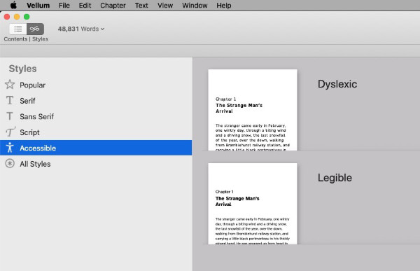
There are two accessible styles available in Vellum. They are named Dyslexic and Legible.
The difference between them is the font choice.
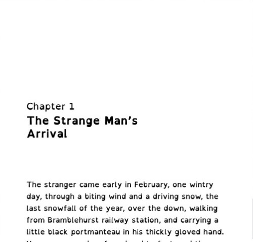
The Dyslexic style uses the OpenDyslexic font from OpenDyslexic.org which describes the font as “…a typeface designed against some common symptoms of dyslexia.”
You can see a sample of Dyslexic style in the following image.
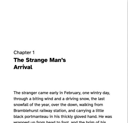
The Legible style uses the Atkinson Hyperlegible font from the Braille Institute. It is named after J. Robert Atkinson, the Braille Institute’s founder.
According to the Braille Institute, the Atkinson Hyperlegible font “…focuses on letterform distinction to increase character recognition, ultimately improving readability.”
You can see a sample of the Legible style in the following image.
It’s very simple to activate one of the Accessible styles for your book.
With your book open in Vellum, click the Styles button at the top of the navigation bar on the left.
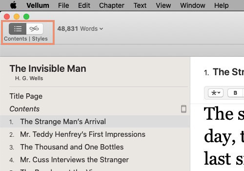
You will see a list of styles in the left column. Choose Accessible.
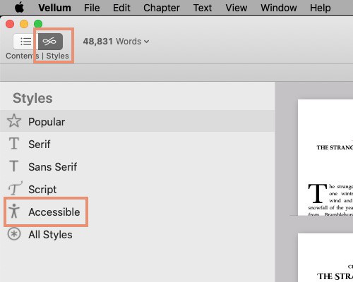
There are two available styles with a short sample of each in the right column. Select Legible or Dyslexic, whichever fits your needs.
The accessible style that you choose will be applied to your ebook and print version.
Add accessible descriptions for images
Vellum also makes it possible to include accessible descriptions for ebook cover images and full page images. You will see the Accessibility Description on the panel where you choose your images.
If you keep the default description, Vellum will use the name of the element. You can create custom descriptions that allow you to give more accurate information about the image and what it portrays. To use a custom description, click in the dropdown box beside the Accessibility Description label. Choose Custom to display a box where you can type your description.
To add a description to inline images in the body of your book, insert the image. Then click the image. An overlay with a circle and three dots will open on the image. Click the image again. A panel will open that allows you to tell Vellum what kind of image it is, how large you want it to be on the page, and how you want text to flow around it.
The center section of that panel contains a text box labeled Add a description for accessibility. Type your description in that box.
Additional hints for accessible ebooks in Vellum
During the process of designing Vellum, the creators of the app regularly check that books formatted in Vellum can validate when run through accessibility testing tools.
There are a few additional things that Vellum’s creators recommend you do to further improve your ebook’s accessibility.
- Be sure the elements that you use in your book have the right type. For example, if the feature is one that you use in print but not in ebooks, exclude that feature element from the ebook before creating your EPUB files.
- If you use images in your book, be sure to include good descriptions.
- If your book contains links, be sure they are behind text that adequately informs the reader where the link goes.
- Store-specific files that Vellum creates will be EPUB3. By default, generic ebook files are created as EPUB2. For the best accessibility, be sure to set generic ebooks to EPUB3. You’ll find that setting in Vellum > Preferences > Generation tab.
Accessibility for print books formatted in Vellum
You might choose to release your book as just one accessible edition for all readers. You could also add the accessible edition alongside your existing paperback, hardcover, and large print editions.
The features discussed in this article are available in standard and large print books.
Effect of accessibility styles on page count
When you style your book for accessibility using the fonts and styling mentioned here, you will find that the page count in your print book increases. That happens because:
- The fonts suggested here are not condensed or as compact as most standard fonts. Accessible books get larger fonts set up with larger line spacing.
- Left-aligning and doing away with hyphenation can decrease the average number of words per line. When that happens, more pages will be required to contain your book.
- When blank lines are used in place of indentions to mark the beginning of new paragraphs, every new paragraph effectively pushes the remaining text down the page and eventually onto a new page.
Print-on-demand book printers price their services partly based on the number of pages in the finished book. For the reasons given above, an accessible book will probably include more pages and therefore require more paper. That can result in a higher print cost per book.
**Final notes about Vellum’s Accessible styles
The earlier descriptions of the accessible Vellum styles pertained to the default (unchanged) features of those styles. The following items can be altered. Which of them is best for your readers is for you to decide.
- There are two optional center-aligned heading choices, but left-aligned is considered more accessible.
- Hyphenation can be enabled in the body settings.
- Justified text can be enabled in the body settings.
- Paragraphs can be set to use indention instead of blank lines to separate them.
You can find more about accessibility in ebooks here.