Vellum for Macs has always offered the ability to customize certain design elements. Now there are even more default choices. As of this writing, there are twenty-four styles available that make it very easy to customize your book design in Vellum v3. Each of them allows users to customize certain features.
Table of Contents
This article updates a similar section based on Vellum v2 in our article Formatting a Book For Print in Vellum. As with Vellum v2, you can change how block quotes and other features will look in your finished document. But now, there are more options available. One of the most exciting options is the ability to insert background images on chapter title pages. You can use the included images or provide your own to lend a visual mood to your stories.
If you haven’t done so already, you’ll need to be sure you have updated your copy of Vellum to at least version 3.3 before you can take advantage of every feature discussed in this article.
If you aren’t sure how to check your current version number, go to the Vellum menu in the top menu bar. Click About Vellum to find your current version number. You can also click Check for updates…to find out if additional updates are available.
Customize your book design in Vellum v3
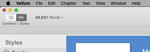
You still go to the Contents and Styles panes, the same way you did in version two. When the Navigation pane is open, you’ll see a split button at the top of it that says Contents|Styles. The Contents and Styles buttons may just contain icons. You can change that by right-clicking anywhere in the top portion of Vellum and choosing Customize Toolbar….
You can choose Icon only, Icon and text, or Text only. If you choose Text only, the toolbar area collapses to a thinner bar than it was with Icons or Icons and Text. You’ll find the words Navigator Display in the top left corner under the minimize and close buttons. If you click on those two words, you’ll have the option to choose Content or Styles.
The words Navigator Display are easy to miss if you don’t know where to look. The Content/Styles mini-menu does not appear unless you click Navigator Display. The Icon only and Icon and Text versions are much more visible and obvious.
Using the Vellum v3 Styles Browser
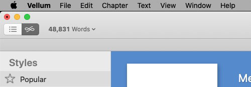
Select the Styles button and you’ll see the Binder and Editor have been replaced by the Styles Browser. The left column contains a list of general style categories that includes Popular, Serif, Sans Serif, Script, and All Styles.
The right column where the Editor had been contains a list of the styles in the category that was chosen in the left column. To see all available styles, select All Styles in the left column. That list will contain twenty four styles, each of which can be customized.
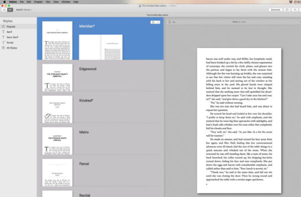
The currently selected style will have a colored background. Others will have a dark gray background. You may see an asterisk beside one or more style titles. The asterisk indicates the style has been edited from its default state.
Open the Preview pane in Vellum v3
As you scroll down the list you will see a short representation of the style in the colored box. In the third column you should see a full-page representation of the style. If you do not see the third column, go to the top right corner and click the Preview button.

If you are styling a chapter heading, but you see a full page from the middle of a chapter in the Preview panel, mouse over the left or right edge of the page, about halfway down. You should see an arrow that you can click to browse forward or backward to a chapter title page. Changing pages in the Preview panel won’t change what you see in the Styles Browser.
Selecting a feature to customize
You may find a style that you are happy with as is. If instead, you find one that you like except you’d prefer a variation of one of its features, you may be able to edit that feature. With your chosen style selected (with a colored background), look in the top right corner of the style. There is a button with two parts. If you click the left side of the button, you will see a list in the left column of every feature that can be customized.
If you click the downward pointing arrow, then Configure, you’ll be able to select the feature that you want to customize. This list is the same as the list you would have seen if you’d clicked the left side of the button. It’s just a bit of a shortcut.
For this tutorial, let’s go with the left side of the button option. When you click the button, you’ll see a list of items that can be styled on the left and examples of them in a carousel in the center column.
By default, Vellum will only list the features that are currently used in your book. If you want to see the entire list as shown above, click the button at the bottom of the left column and select All Features.
Using predesigned features in Vellum v3
Some features in the list are more customizable than others. The number of examples in the carousel gives you a hint to how customizable that item is. For example, Heading has three choices, but First Paragraph has eight. Click the right or left arrows below the examples to scroll them. You’ll see a preview of an actual page from your book in the right (Preview) column.
In Vellum v3, for each of the 24 styles, you can scroll horizontally and select pre-designed choices for the following features except Body:
- Heading
- Heading Background
- First Paragraph
- Paragraph After Break
- Ornamental Break
- Block Quotation
- Verse
- Photograph
- Portrait
- Caption
- Header and Footer
- Body
If you select Body from the features list, you will see that it has no carousel from which to select styles. Instead, you are given the option to select the font for the print edition, whether paragraphs are indicated by an indentation or a space between them, and whether you justify text and allow hyphenation at the end of lines.
When you see the style that you like most, stop scrolling. The style you stop on will be automatically assigned to your book project. To customize another part of the style, choose that item from the list on the left and run through the choices until you find one that you like more than the others.
Some features from the list are not directly customizable, such as the Heading, First paragraph, paragraph, and block quotation.
Other features allow some customization right from the carousel. You’ll know those if you see a button under the carousel or if there is no carousel for that feature.
Beginning with Vellum version 3.3, you can customize your headers and footers, including their layout and alignment.
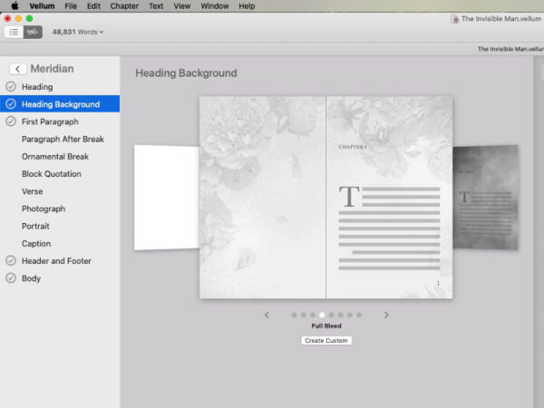
One that has a customization button under the carousel is the new feature for print books only, Heading Background. Click the Create Custom button to open a settings panel that allows you to choose your own background image and set whether the image is one page only or a two-page spread. You can also adjust the Image Presence which causes the image to fade out so the text is more visible.
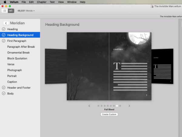
You can set the background image so that it only fills the page within the text margins, fills the safe zone (the area that is safe from trimming during print book production), or full bleed.
If your image is one that you are using to create a dark background, you can tick the box to use white text. Only the title page of the chapter will have white text. The remaining pages will have black text.
You can customize the image that appears as an ornamental break between scenes. If you choose Ornamental Break and click the Create Custom button, you can select your own image and adjust how large it appears on the page. You will be warned if the image is too large or small.
These examples should give you an idea what to look for and how to see what you can customize for each feature.
When you’ve finished choosing styles, I recommend you save your project.
Format text as text messages or handwritten notes
If you’ve updated your copy of Vellum to version 3.4 or later, you can very easily format sections of text as mobile phone text messages or as handwritten notes.
To format your text either way, select the text that you wish to format. Then click the Gear icon at the top of the Editor pane to open formatting options. From the list, click Text conversation or Written note, whichever is appropriate.
For text messages, you’ll be able to format the messages right in the Editor. Click on a line of text. A small set of options will appear to the right. Choose to format that line as the sender or receiver. You can also format a line as the name that the message is from, just as it would be on your mobile phone.
Notes to remember when using Vellum to style your books
Styles are chosen on a book-wide basis. In other words, there is no way to choose a style for one chapter and another style for a different chapter.
NOTE: Most styling choices apply to both the print version and the eBook version. Two exceptions are fonts, which can only be selected for print versions because eBook users can set their own fonts, and headers and footers, because they don’t exist in eBooks.
As you customize your books, try not to be confused by Headers and Headings. In Vellum, a heading is the chapter number and title on the first page of a chapter. Headers display the title, author’s name, and page number at the top of the page.
